The article on our model for Covid-19 progression is available at MedRXiv
The completed forecast graphs are posted here:
10/04/2020 (65 countries)
12/05/2020 (72 countries)
21/06/2020 (98 countries)
The software (with Ada source code) is available here: XPH Covid-19 distribution
It contains a Windows x64 command line executable (xph_covid19.exe) capable of running on several CPU cores ( -c #cores). “-c 4” switch shall be adequate for most machines, with calculation time of about 60 s per country.
Other switches are:
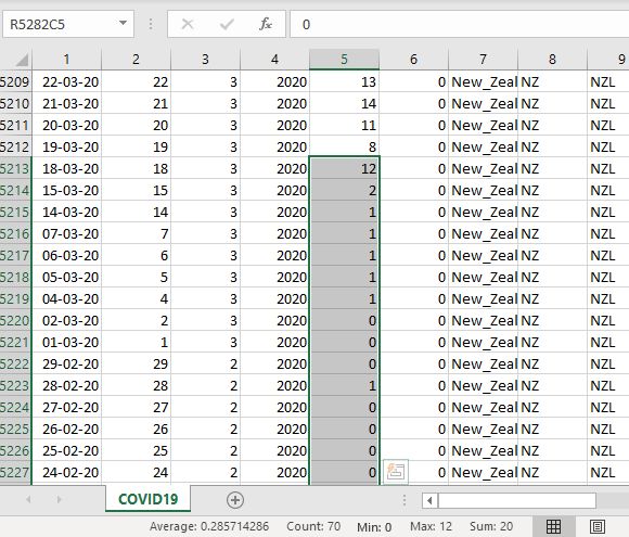
-s [start day] – the number of the day in the data file (see below) from which to start modeling. The easiest way to find that number is to open COVID19.csv and select the column with reported cases for a country up, until there will be some numbers. The “count” in Excel status line will be that start date:
-e [end day] – the last day to include in the model if one doesn’t want to use the whole range;
-d – to minimize the model by the population density instead of progression rates (see the manuscript for details).
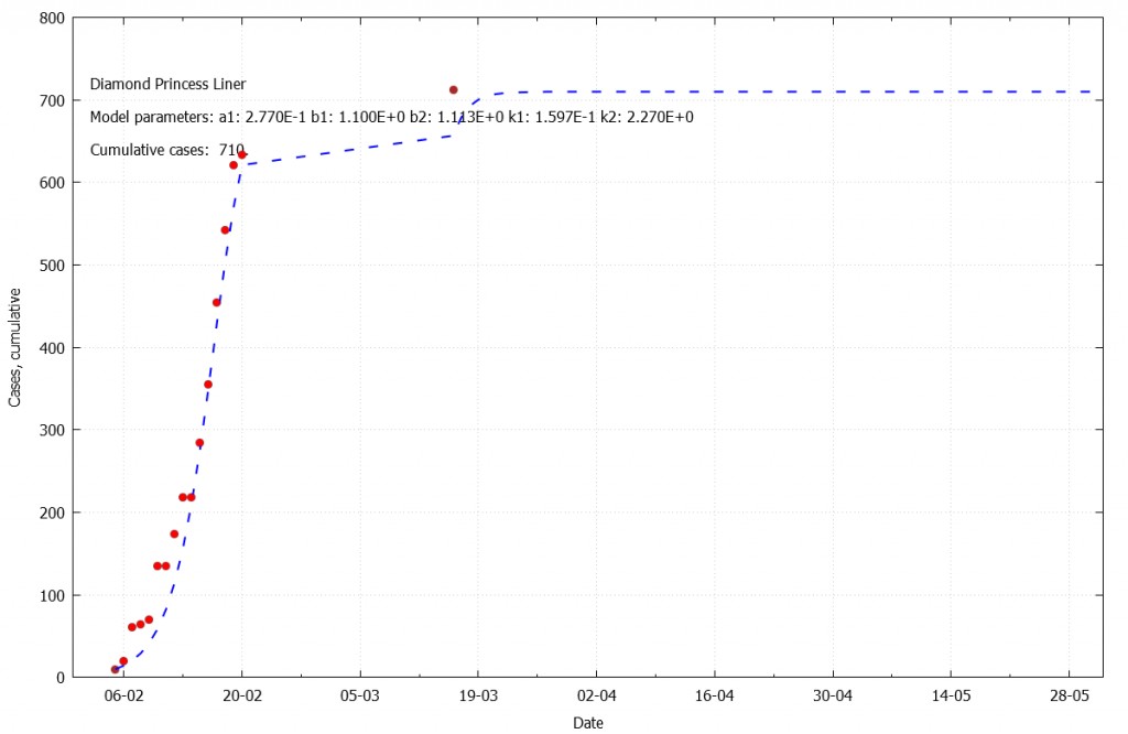
The input data are in the COVID19.csv file, which needs to be generated from the daily data published by European Centre for Disease Prevention and Control, and must reside in the same directory as the executable. The file enclosed in the distribution is from 01/04/2020, and also contains the data on Diamond Princess Liner (country code DPL).
The program outputs two files: xxx_forecast.csv and xxx_forecast.gp (xxx is a country ID). The first one contains model results:
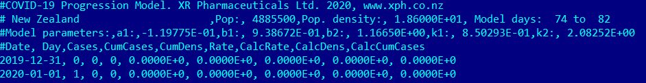
The second line is a general info about the modeling, including start and end days. The third line contains the five model parameters (see the manuscript), and the rest of the file is the reported and calculated data:
Date, Day (0,1,2…), Cases reported, Cases cumulative, Density of cumulative cases (Cumulative cases/country area), Rate per day, Simulated rate, Simulated cumulative density, Simulated total cases.
The gp file is an input for free gnuplot charting software.
The final graph could be obtained with the following command:
gnuplot xxx_forecast.gp
The gp file is human readable and editable. For example, one might want to expand the time axis beyond the default “2020-06-01” to see the plateau. The model generates data for 400 days total.
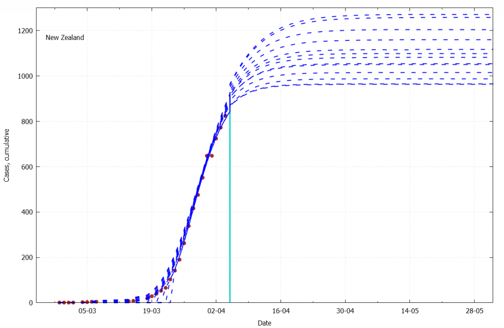
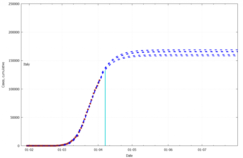
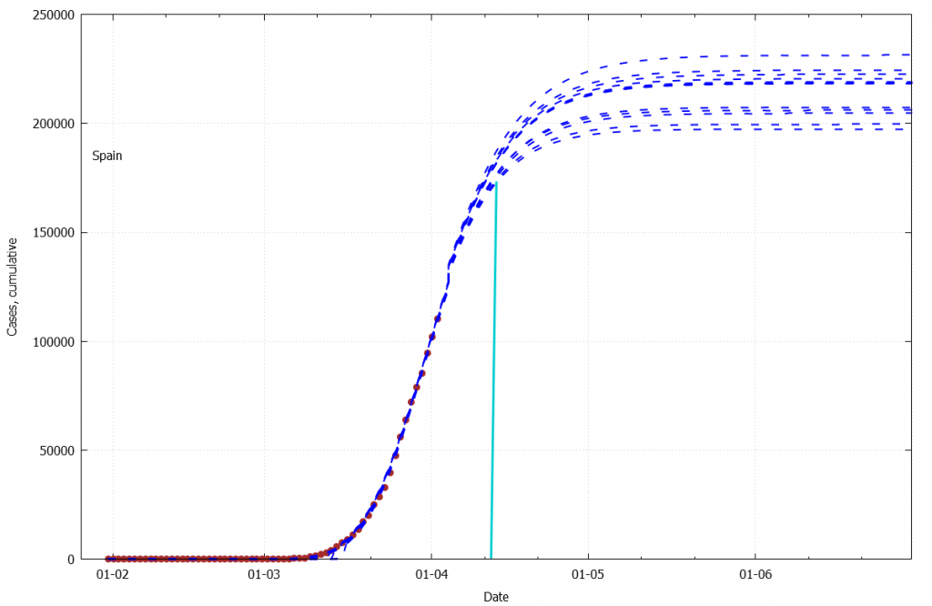
The generated graph also contains the model parameters, plateau value of cumulative diagnosed Covid-19 cases, and the “bend” date. For the lack of better definition, “bend” is currently set as the date when 85% of plateau value is reached.
Brown dots on the graph are the reported data, which was not included in the model; red dots are the data included; blue line is the model forecast.
The archive below contains the example forecast for the following countries (to be updated): China, Diamond Princess Liner (DPL), Spain, India, Italy, S. Korea, New Zealand (also updated daily on this page), Russia, Singapore, Sweden, USA.
Please note: the plateau values for some countries are very sensitive to the data selection. We are still working on a better data selection methodology.
Few more examples below
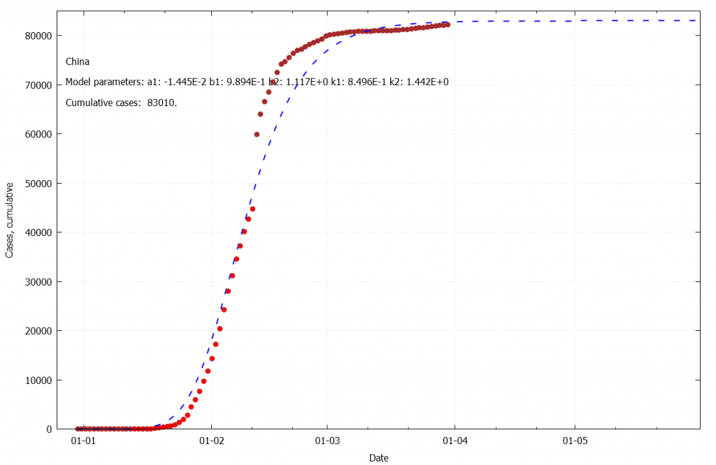
(only the red dots were used in the model)
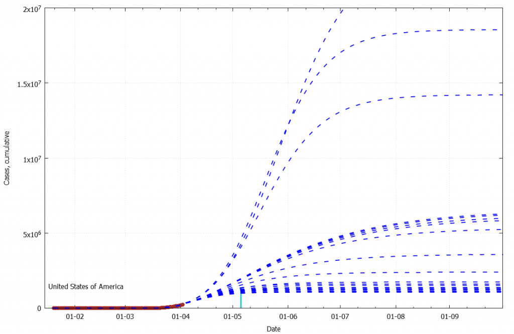
Such a chaotic behavior indicates that the country is at the very beginning of the S-curve. Other countries showing similar pattern are Sweden, India, Singapore, Russia.